LOGO DESIGN,
CORPORATE IDENTITY
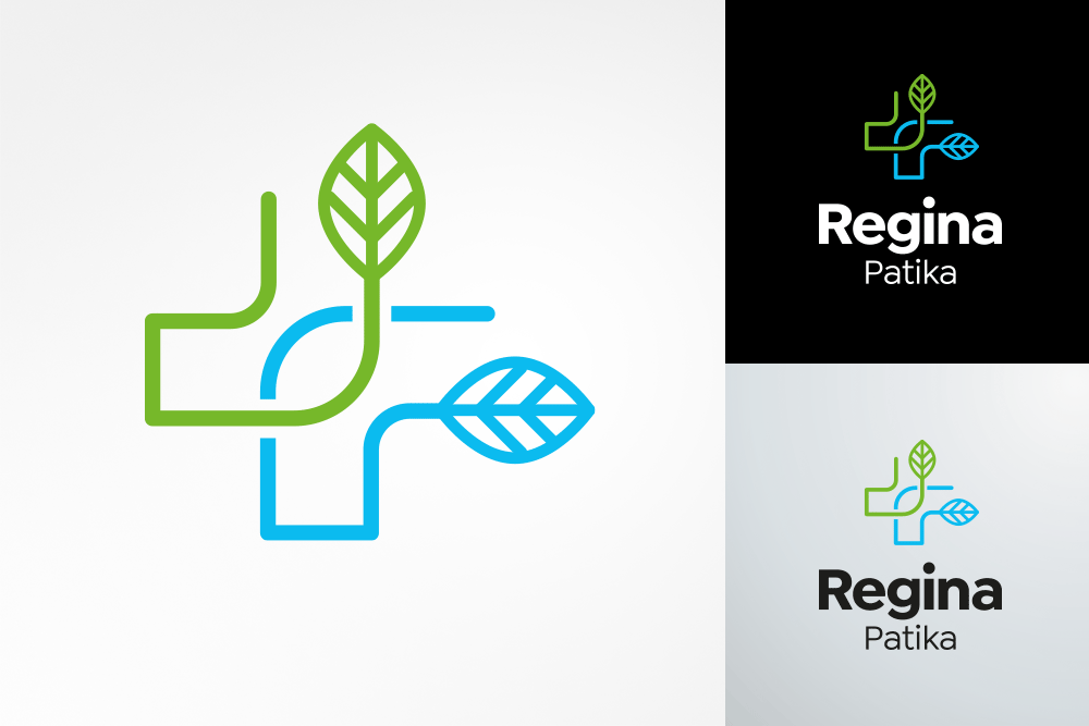
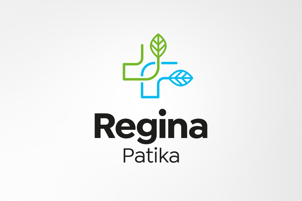
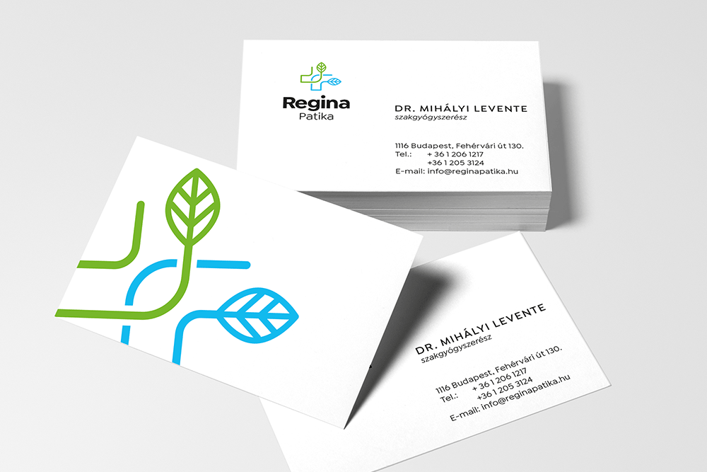
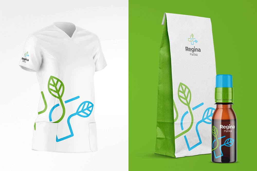
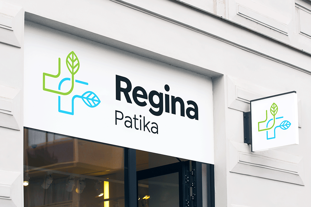
REGINA PATIKA
Our client—a family-run business—operates multiple pharmacies under various brand names. Our task was to bring visual unity to these locations through a cohesive brand identity.
In line with the owners’ request, we avoided the use of conventional pharmacy symbols in the logo. At the same time, it was essential that the final design clearly reflect the field of activity.
We found our solution by drawing inspiration from organic forms found in nature. These were then refined and reinforced with geometric elements and a clear, identifiable color palette to strike a balance between softness and precision.
Illustration by Luca Fonódi.